Designing HIV care for the people outreach was missing
Arizona's main HIV website was losing the people its programs most needed to reach. I chose to design for them first, cut a quiz that tested well down to a single question, and shipped a site that starts a conversation instead of a search.
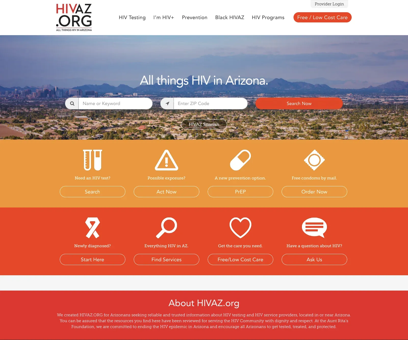
A site losing the people it was for
HIVAZ.org is the state's front door to HIV care. Three people at Aunt Rita's Foundation run it, and none of them are developers. Most visitors arrived on a phone, and 80% of them left after one page. The design didn't help. "All the red and orange makes me think there's something urgent," one tester said. "I'm already stressed."
The state wanted more people using its HIV programs. But those programs don't measure success by traffic. A testing program succeeds when it reaches people who have HIV and don't know it yet, and they are the hardest people to reach.
Designing for the people programs most needed
Stigma came up in nearly every interview, usually before the website did. I've been through a diagnosis myself, and I worked to keep my story from standing in for anyone else's.
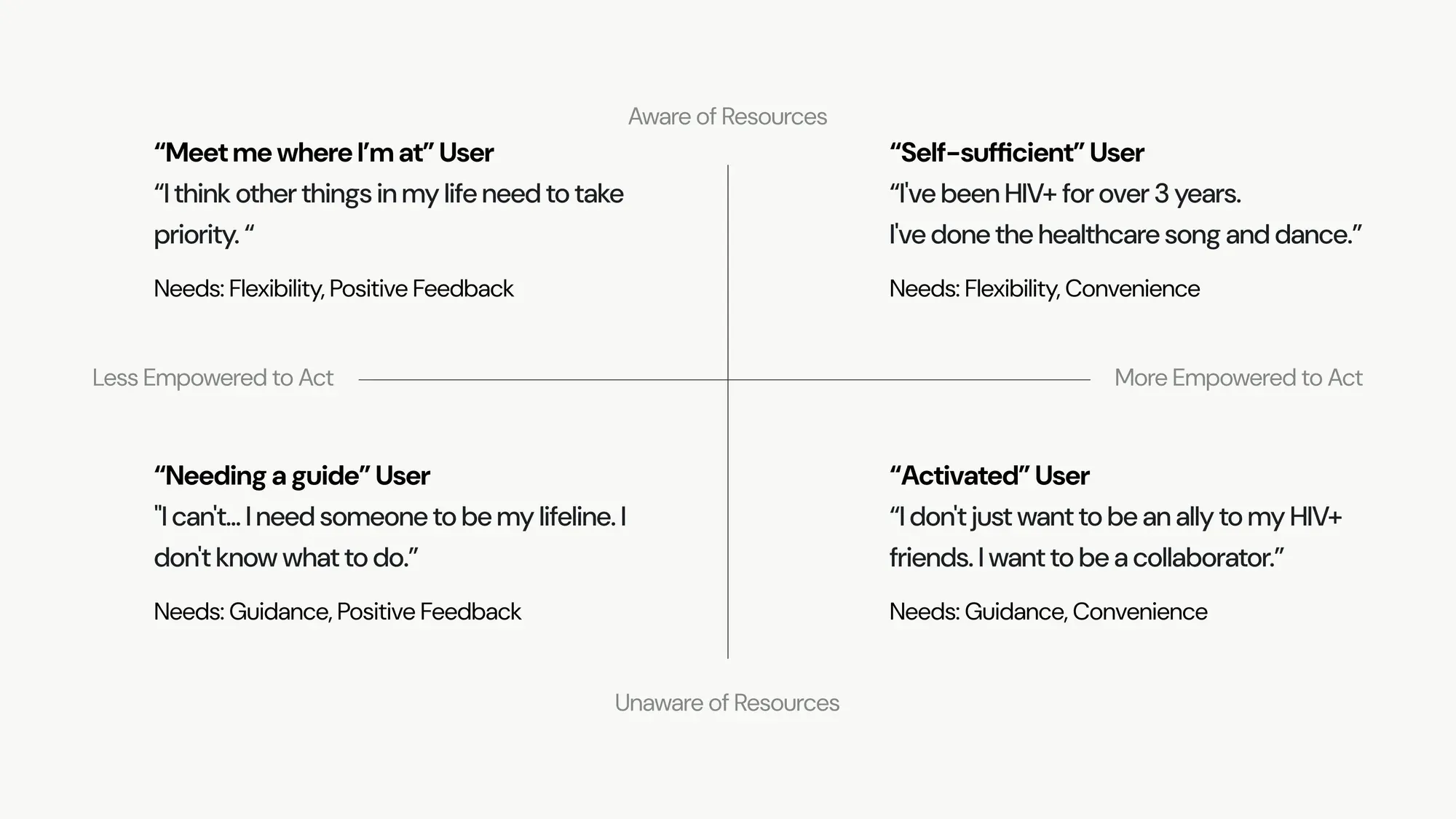
People with steady access to care usually already have prevention in place, so they rarely test positive. They were also the easiest people to design for, and existing outreach already served them well. The people the programs most needed were the ones with the least access to care: unhoused, immigrant, BIPOC, and underage Arizonans. "I need someone to be my lifeline," one person told me.
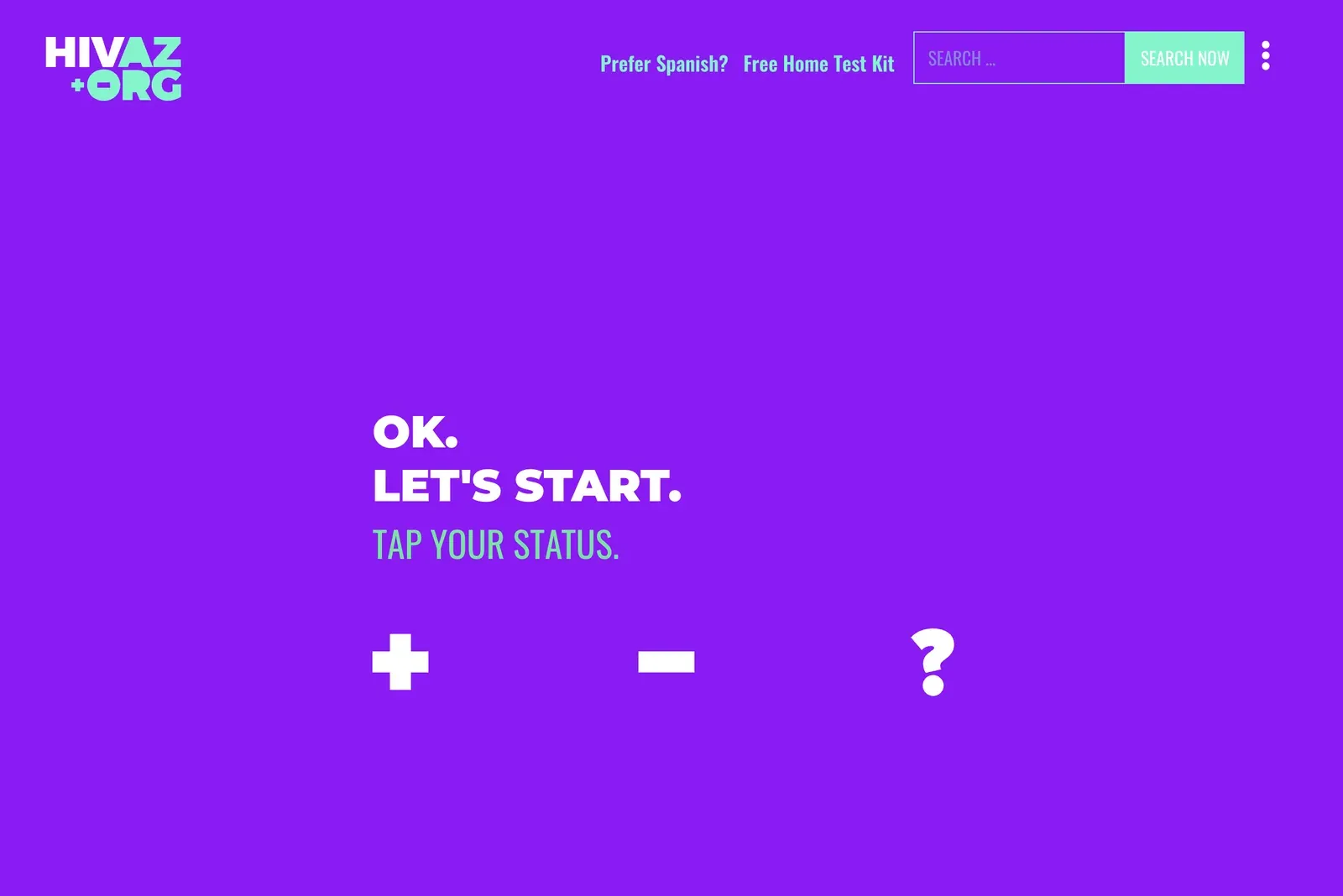
Health organizations know these are the people to reach. The hard part is reaching them. So the question changed from who the site was for to what a frightened person with little support could actually do on a phone. The answer cost the site its original promise. HIVAZ.org was built to be "all things HIV in Arizona," and designing for people with the least access meant moving most of that information to a separate part of the site, so the main path could do one thing well.
Cutting a quiz that tested well
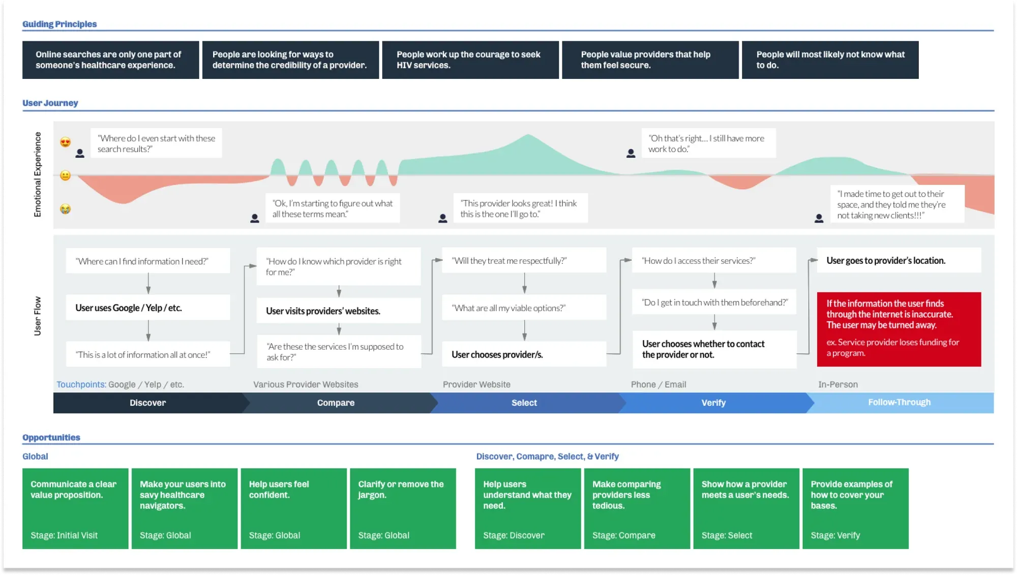
My first two concepts, an action plan and a provider directory, both added structure, and both overwhelmed people who were already anxious. The third, a short quiz ending in recommended providers, tested best of the three. The question was who it worked for. Each added question helped people with steady access to care, who wanted details about providers and the convenience of care matched to their own needs.
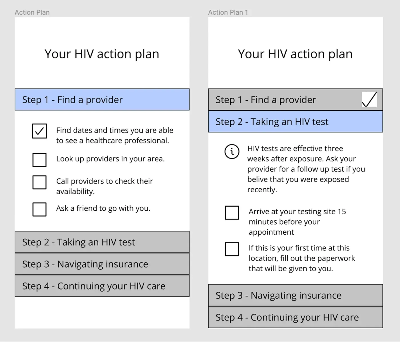
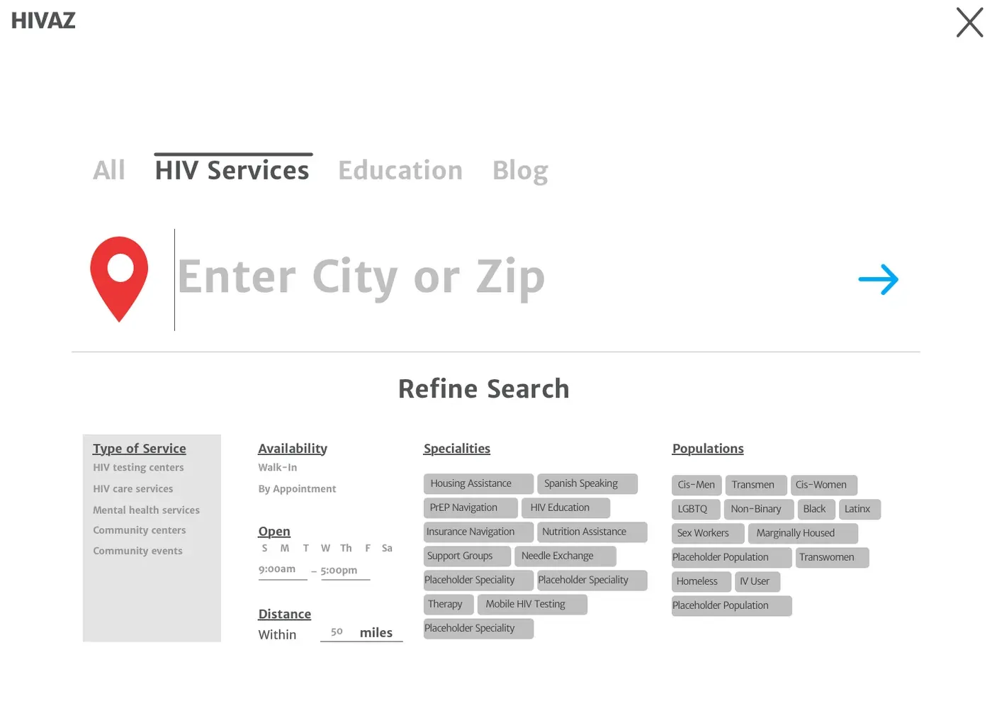
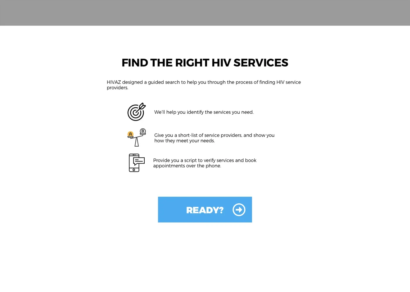
That finding brought the tension with Aunt Rita's Foundation into the open. Giving those people the detail they wanted meant gathering more provider information than a team of three could handle, and the foundation pushed back right away. The turning point was returning to what we all already knew: people with the least access need the most help, and they have the highest rate of undiagnosed HIV. Once we were designing for them again, the answer got smaller, not bigger.
So I cut the quiz down to one question.
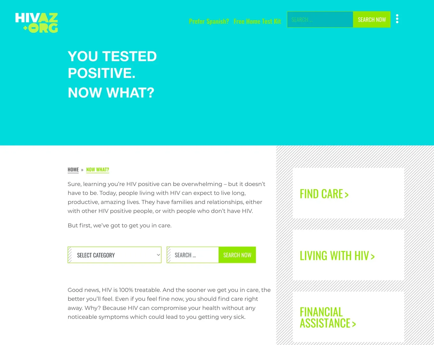
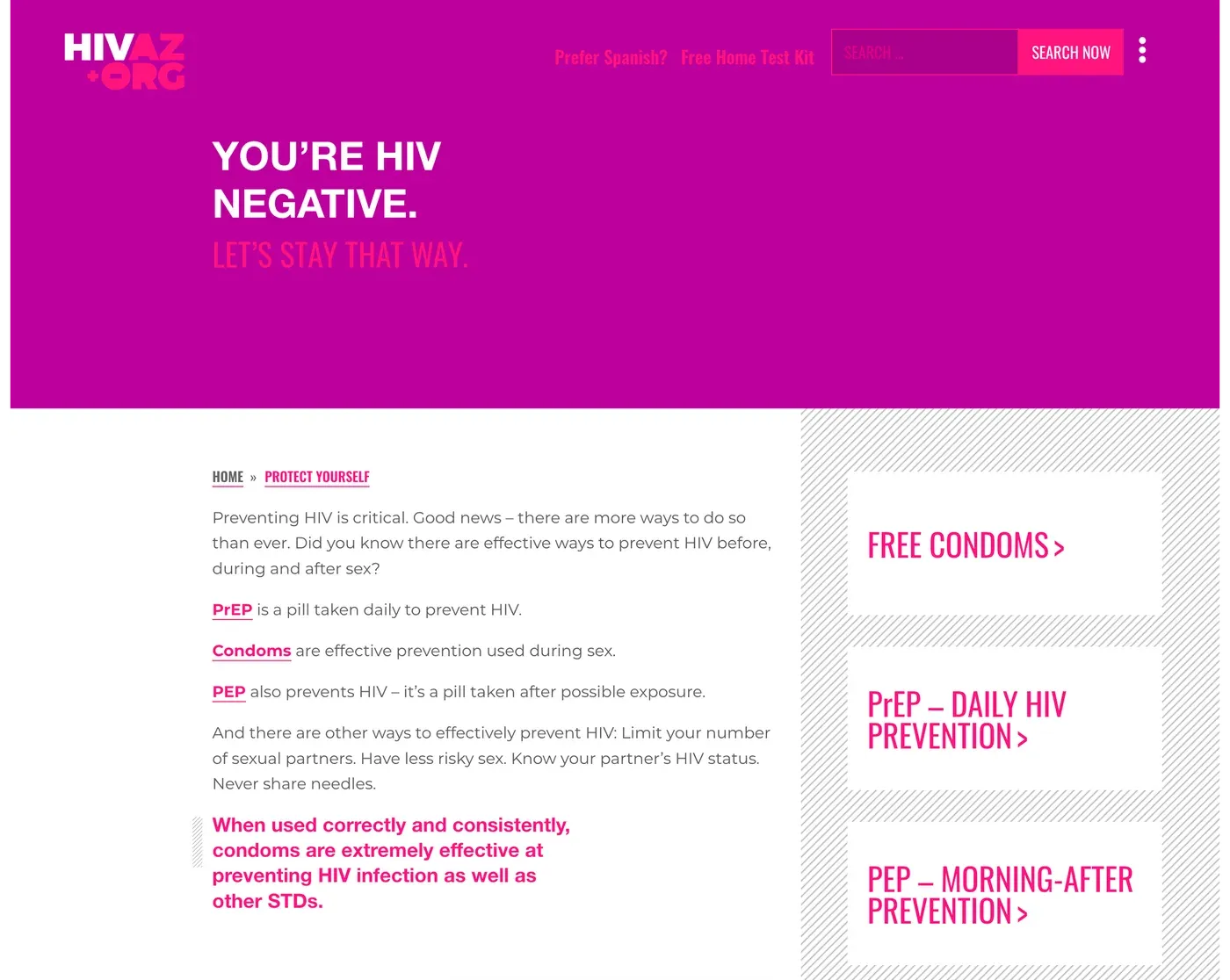
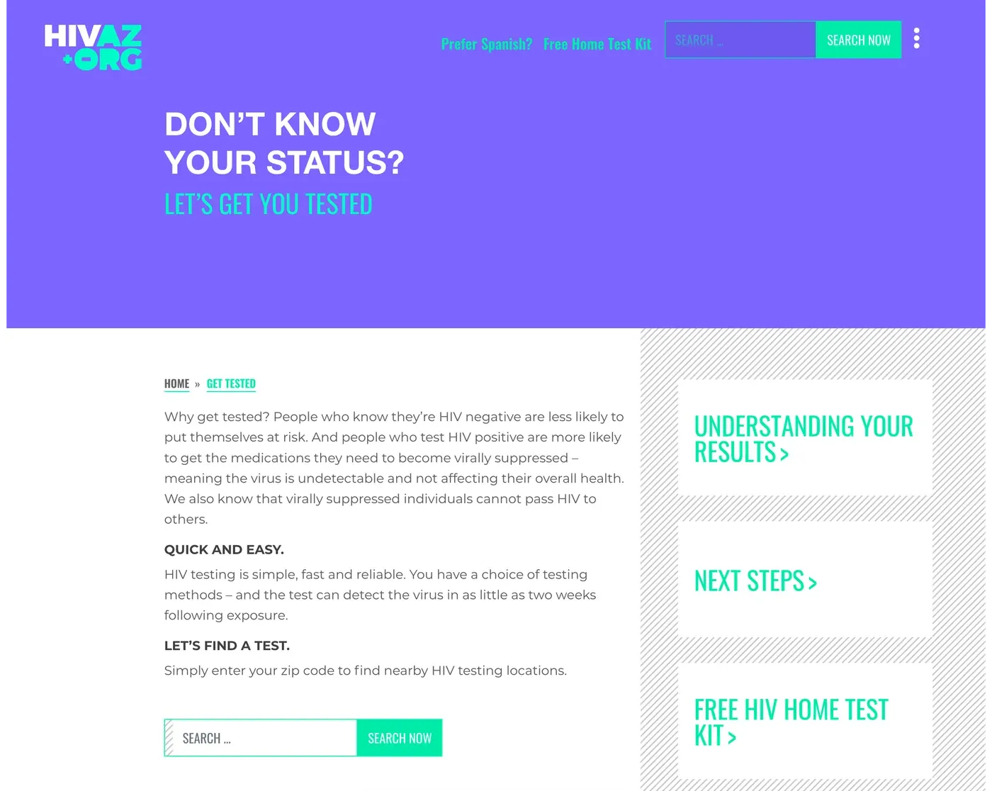
What changed
Measured after launch, against the site it replaced:
Use of the state's HIV programs rose too, and that was the measure the state cared about most.
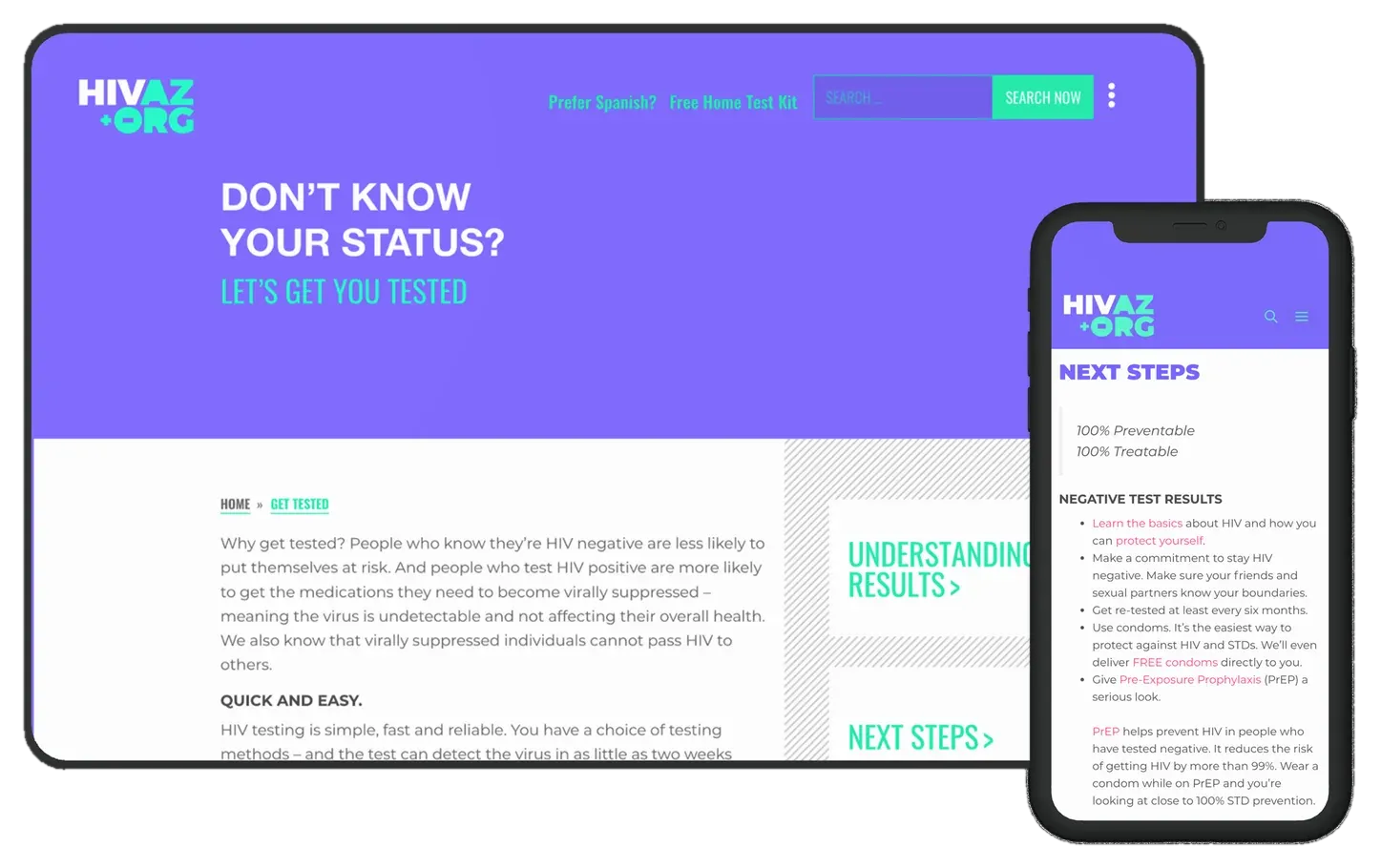
Looking back
The audience call held up. The timing didn't. The answer was inside the quiz all along, and testing a single question from the start would have found it sooner.