IBM • DevOps • Data Visualization

From Hours to Seconds: Redesigning Data Lineage at IBM

As design lead, drove the full research, concept, and delivery process to replace IBM Infosphere with a performant, watsonx-integrated data lineage experience, cutting retrieval time from hours to seconds and earning a Red Dot Award.

01 Summary.

Data lineage is crucial for compliance. Close collaboration with ING, State Street, and Rabobank, along with user research cycles run in parallel, led us to immediately valuable and desirable designs.

  • The Ask

    IBM Infosphere was a decade old and being folded into the new watsonx platform. The brief: modernize data lineage, improve performance, and embed it where enterprise users actually work.

  • The Approach

    I led a three-person UX team, ran co-creation workshops with ING, State Street, and Rabobank, and partnered with engineering, product, research, and clients across three time zones to ship a redesign that won contracts and a Red Dot Award.

  • The Outcome

    Loading time decreased by up to 90%. Multiple new design patterns adopted by IBM.

Project Resources

Design Lead My role

9 Months

2 Other design team members

3 Partner Companies: ING, State Street, Rabobank

Outcomes

Red Dot Award Received

Up to 90% Increase in performance

$100K+ In new contracts

2 Products at different pay tiers

6 years later and still relevant

My work has persisted, and is being actively used. You can see and try the current state of data lineage at IBM.

02 Defining “Modern.”

Modern data structures are massive, and always changing. To be modern meant addressing the volatility of changing data landscapes that slow down a user’s ability to get answers to their most pressing questions.

The business case

Up to $23M In fines for regulatory compliance

300+ Possible points of failure in a data pipeline

Hours To identify points of failure

100+ Of UI gestures to identify points of failure

Ship the “Summary View” — start focused, stay focused

Competitors rendered the full diagram (slow) or forced manual queries (painful). The Summary View lands users on the simplest level — first source, end consumer — and lets them pull more detail when they need it.

Show every node by default
Seconds to first useful answer
Outcome
Won concept testing on both desirability and usability. Time-to-value moved from hours to seconds.

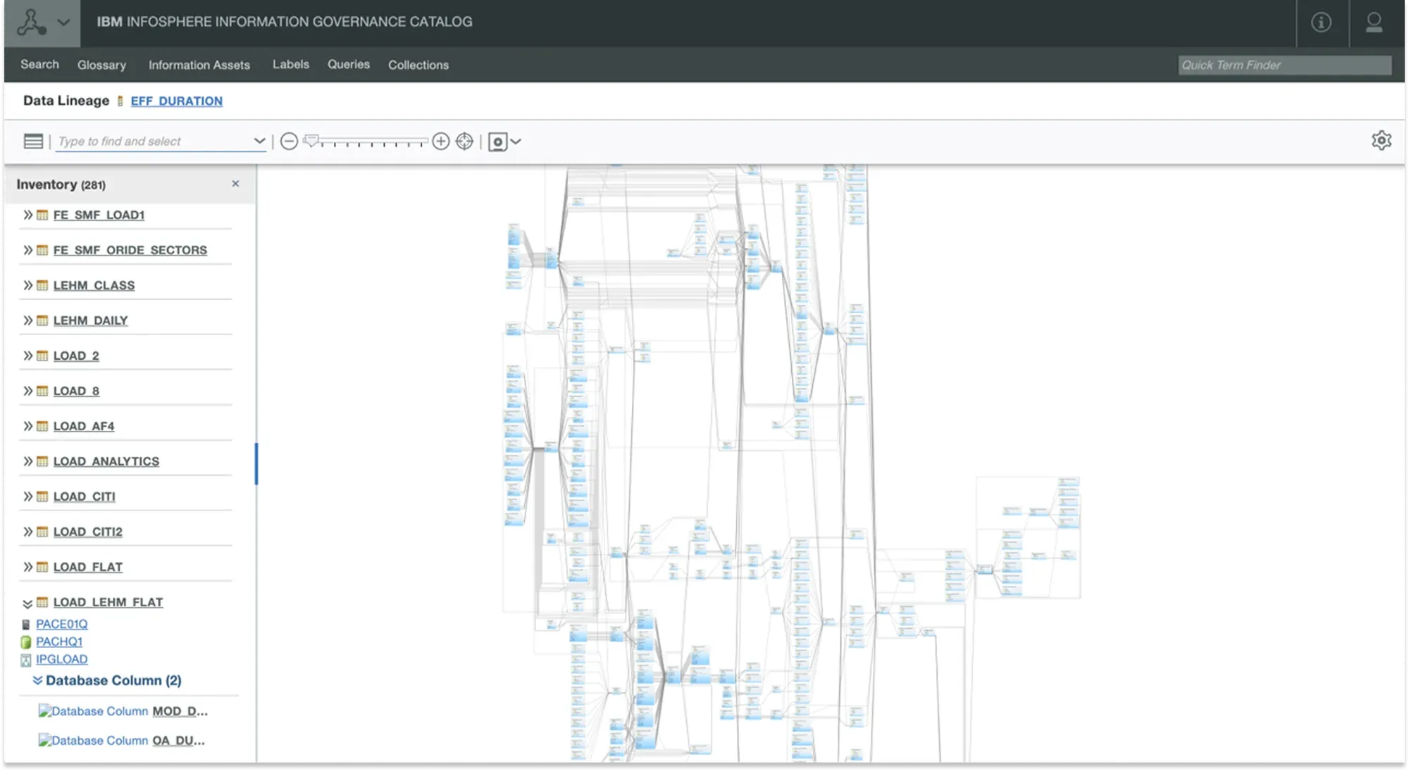
The before.

This is a trivial data lineage from IBM Infosphere. Purely technical metadata (revealed through a hover tooltip!), no business metadata, and difficult to read.

The original IBM Infosphere data lineage: a cramped technical diagram with no business metadata and details hidden behind hover tooltips.

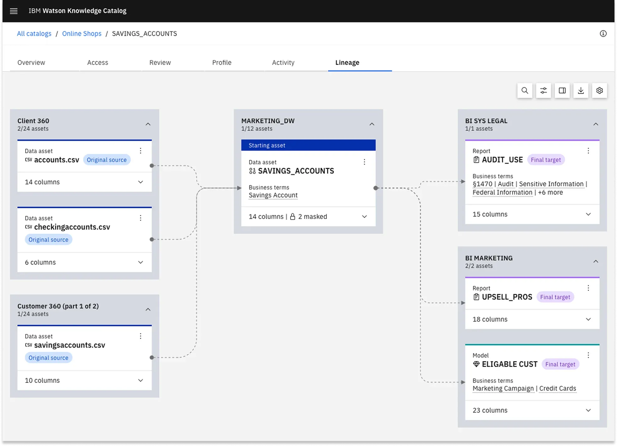
The after.

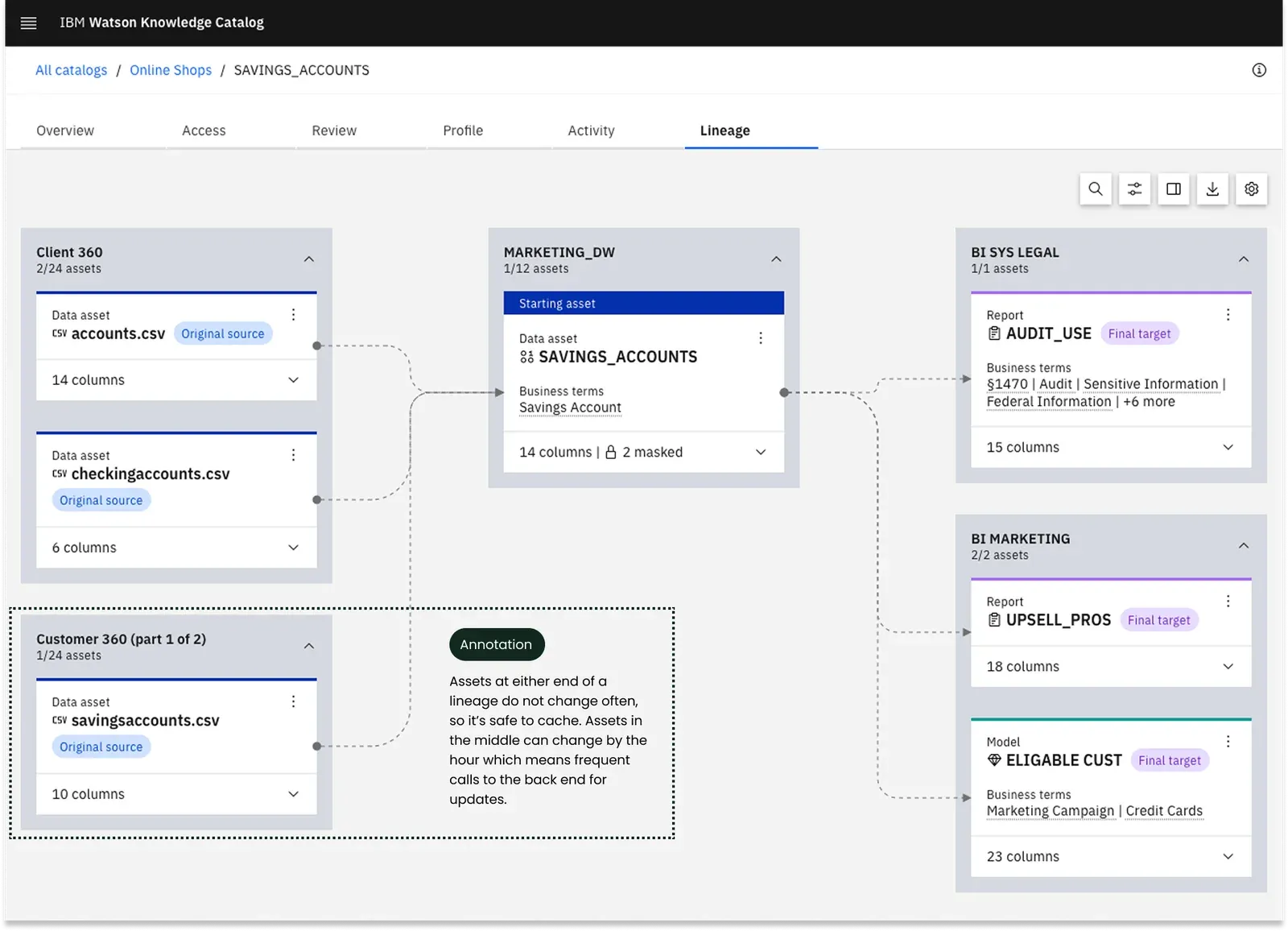
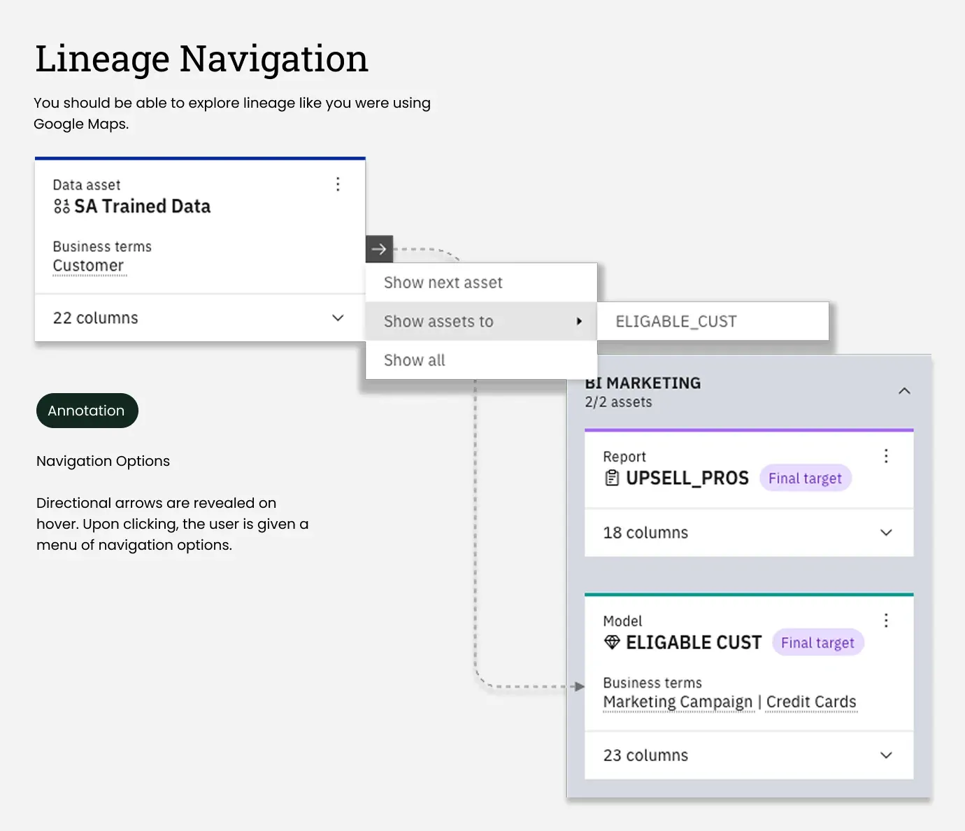
Put control of size and scope in the users’ hands. This was achieved by surfacing the original sources of the data, and the end consumers of it. Users can then choose how broadly to reveal the upstream or downstream flow of data, and how granular they want their lineage to be. They can even choose to filter down to the lineage of a specific column in a dataset.

The redesigned data lineage: a clean Summary View showing original sources and end consumers, with controls to expand the upstream and downstream flow on demand.

03 Where did the idea come from?

No single source gave us the Summary View. A competitor’s pattern, a freshly filed patent, and an internal team’s diagram all three pointed at the same problem and each one failed differently. The idea came from naming why all three fell short.

Synthesize three weak signals into one concept, rather than picking the closest match.

Collibra’s pattern, the pending patent, and the DevOps team’s diagram each solved one part of the problem — performance, clarity, or invitation to explore — and broke on the rest, so none of them was safe to adopt wholesale.

Adapt the closest existing pattern
A concept none of the three sources had shipped
Outcome
Won concept testing on both desirability and usability; became the pattern the rest of the product was built around.

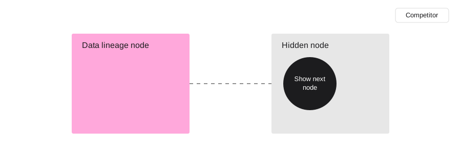
From our competitor.

Our competitor Collibra had an expanding interaction in their data lineage; however, it only allowed users to expand one step at a time.

Pros:

  • Managed performance by limiting the amount of the data lineage revealed at a time.

Cons:

  • Tedious process to get to original sources of data, and the design pattern would not scale to our scope (~300 steps in our data lineages).
Our competitor Collibra’s data lineage

From secondary research on current patents.

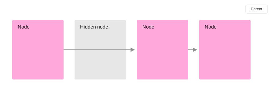
A new patent had been filed during the time of the project that described a data lineage where intermediary steps were hidden unless flagged to always be shown.

Pros:

  • Reduces bloat on the data lineage, leading to more relevant information being surfaced first.

Cons:

  • Flagging requires metadata to be applied by the user or automatically, either way it requires an additional user flow that would be out of scope for our MVP.
Chart showing the data lineage with intermediary steps hidden

Analogous inspiration from another team.

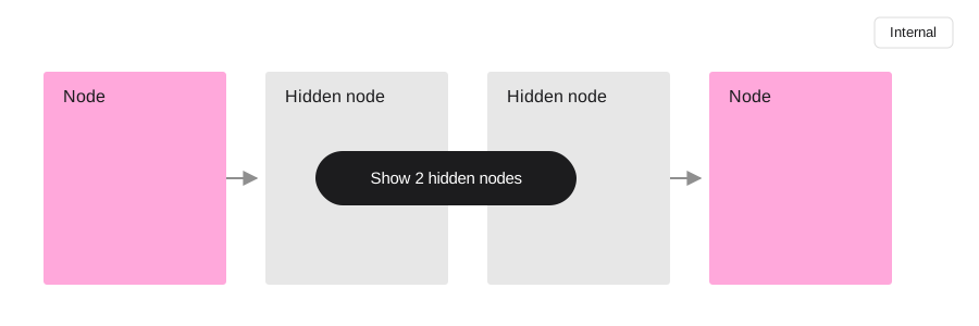
The DevOps team was designing a network diagram that mapped automations. It used a pattern that grouped similar content, and showed how much content was in the grouping.

Pros:

  • Again, reduces bloat, but also invites the user to expand the diagram to reveal more information.

Cons:

  • Would require the same expensive queries to fetch the count in the hidden sections of the diagram.
Analogous inspiration from another team.

04 A unified experience targeting deep pain points.

Three products — data catalog, data quality, and lineage — got folded into one experience inside watsonx.

Generalize the lineage model beyond the mandate, rather than let four other teams rebuild it separately.

Leadership had mandated folding lineage into watsonx alongside Catalog and Quality. What wasn’t mandated was that ETL, the AI model team, and others would come asking for the same logic, for data that looked nothing like ING’s banking transactions.

Ship lineage to the three-team spec
One pattern ETL and AI models could reuse.
Outcome
Six years on, the same patterns still ship in IBM’s lineage product, and the platform-wide backlog it surfaced has since been built out by other designers.

ING’s Point of View

“[Data lineage] should be like seeing out onto the assembly line of a factory. You can see where everything is and where things are going wrong.”

ING’s Chief Data Officer

Understanding how pain points move users.

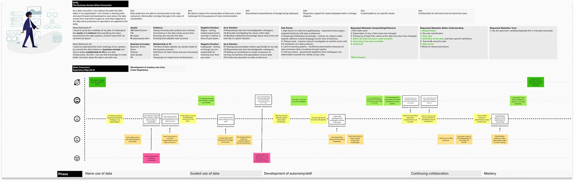
I contributed an in-depth persona, user journey, and mental model diagram. My work combined with the massive site map created by the data quality team allowed our teams to have a unified strategy on how we move the users from the paralyzing frustration of trying to find an error that’s like a needle in a haystack to getting it fixed.

A large, in-depth journey map of a persona’s journey across data lineage

One info page, three products, a seamless way to fix problems.

The largest behavioral pain point affecting our users is the belief in the need for hyper-vigilance. Data structures can be brittle. Combining our three products together lets users find where data has degraded through lineage that tells users the quality of the data at each node in the pipeline. And it allows them to go to the source of the degradation and remediate that data, all in a few clicks.

The entire process takes a few minutes, which is a marked improvement from the hours it used to take just to identify where degraded data sat in the pipeline.

IBM Watson X view of the Knowledge Catalog

05 Filling out the other requirements.

Novel as the Summary View was, it didn’t satisfy every requirement of a full product experience. To round out the product, I facilitated regular design workshops with our business partners to flesh out all the details.

Bi-weekly co-creation with ING, State Street, and Rabobank.

Standard research would have meant interviews up front, then designing in a vacuum, then testing at the end. I proposed recurring co-creation with three named enterprise clients instead — generating and testing solutions in the same loop.

Faster, lighter research cadence
Desirability + feasibility in one loop
Outcome
Concepts arrived pre-validated by the exact buyers we needed to convert. The three workshop banks shaped the eventual renewals.

In person and online.

These workshops really revealed the frustration our users had with the lack of clear signal that something was wrong and where the errors originated from. It led to the combination of surfacing the data quality scores and the navigation patterns for the lineage diagram.

(This picture is from a workshop with ING’s CDO team, hosted at the IBM offices in Poland, an 18-hour flight!)

IBM workshop attendees gather around me as I facilitate co-creation sessions.
Professional headshot of Lauren Chen

Lauren Chen

Nahi is a talented designer with an impressive range of skills and experiences. I’ve never met such a well-rounded designer who is skilled in everything: UX design, producing pixel-perfect hi-fidelity designs, leading workshops, conducting user research independently, defining product requirements, and stakeholder management.

Co-worker

06 Lessons learned for the next time.

The most difficult part of this project was ensuring that there was alignment on every decision. Meetings were frequently derailed by retreading old decisions. While it was necessary sometimes, I often found myself spending hours rehashing decisions with stakeholders. Because of this project, I started keeping a decision diary for my stakeholders where we could refer to each decision made and why. Doing this from the start would have freed up the hours we spent re-litigating old decisions — time that mattered more than usual on a project where I was designing for durability under deadline pressure, knowing the backlog would outlive my own time at IBM.