01 Summary.
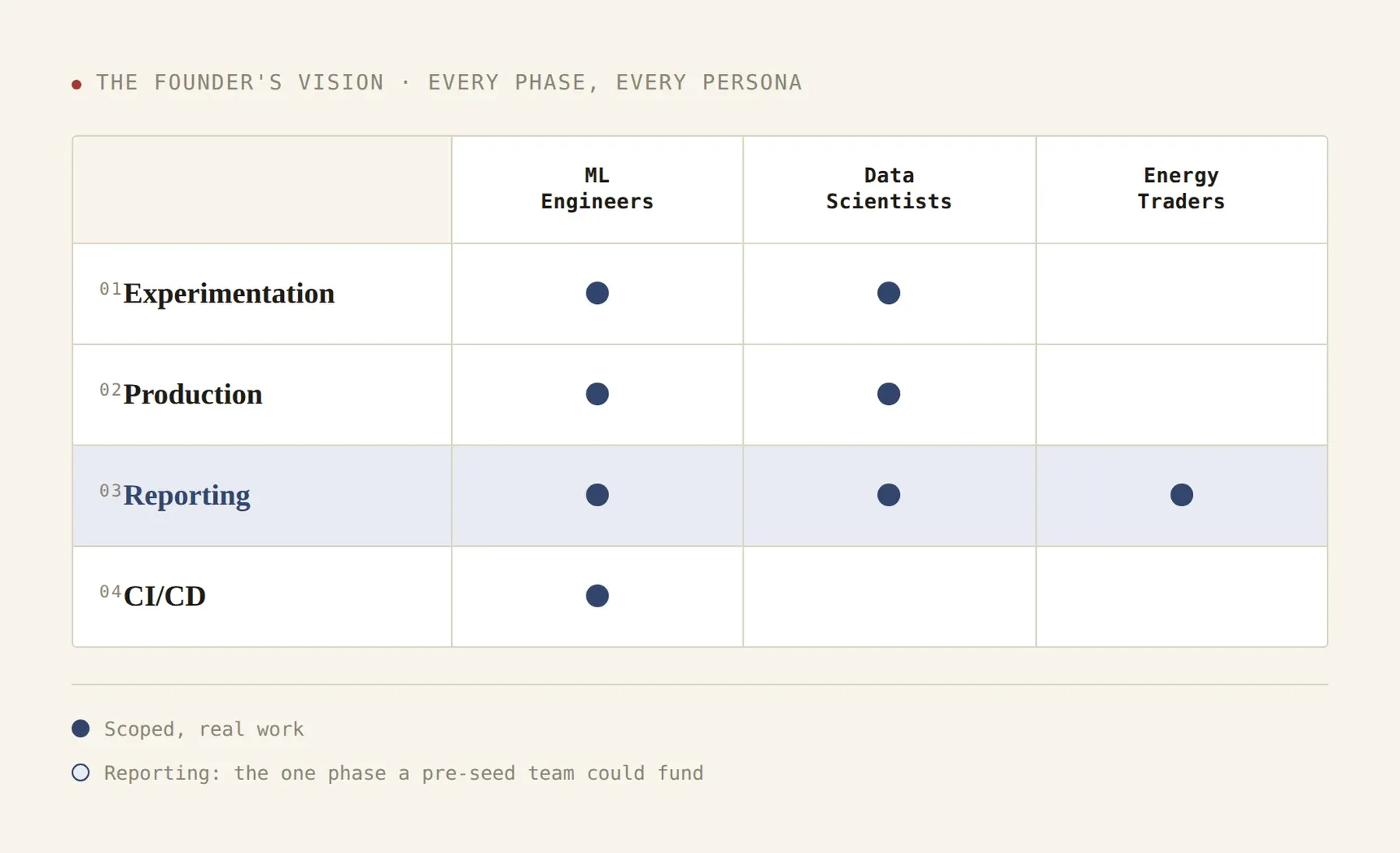
My client’s grand vision was a unified surface for ML engineers, data scientists, and energy traders.
-
The Ask
Ship an MVP energy forecasting product, MLOps features to support the energy trader experience, and an investor-ready marketing site, in parallel.
-
The Approach
Cut scope to the value prop. Used Radix UI to move fast, then custom-built where it mattered.
-
The Outcome
Proof of concept built, and actively pursuing investors for seed funding.
02 Constraints, but not barriers.
I had to translate this grand vision into a realistic and achievable goal. They are a pre-seed startup with limited people, time, and resources.Together we honed in on the one big idea that gets them funded: state of the art AI/ML methodologies that produce more accurate forecasting models.
90 Hours
5 Projects
1 Designer
1 → 2 Developers
4 Design Disciplines
Cut the MVP from two audiences to one.
The original MVP served energy traders and ML engineers with both business intelligence and operational tooling. I pushed to ship forecasting for traders first — and design the rest, but not build it yet.
- Cover both audiences
- Ship a sharp investor demo
- Outcome
- Scope cut roughly in half
Internal Signals
- —Team capacity: one part-time developer at the beginning and expanded to two developers for the last project — building two parallel product surfaces was not realistic.
- —Founder energy in workshops was highest when describing the forecasting accuracy story; MLOps tooling was talked about as “table stakes.”
- —One-sentence value prop: the forecasting model was the only thing I could explain in one sentence — that’s the thing investors would remember.
External Signals
- —User pain: traders had dollar-attached losses every week; ML engineers had workarounds.
- —Competitive gap: competitor MLOps was mature; competitor forecasting accuracy claims were vague. That gap was the wedge.
- —Pitch feedback consistently asked “what’s the moat” — accuracy demos answered it; admin tooling didn’t.
Scope control.
An MVE is the simplest version of a product that’s ready for real users; it covers every surface they’d need. An MVP can be narrower: a technical demo built for one audience. QuantaLyric needed both, but not both built. I designed the MVE so the team could communicate the full vision, and built the MVP: the reporting surface, as the technical demo for investors.
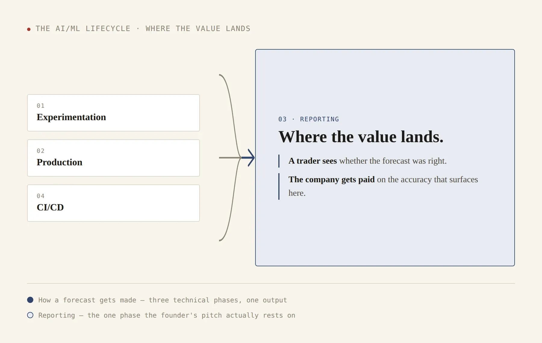
From my research, the AI/ML lifecycle has four phases: model experimentation, production development, reporting, and CI/CD. Reporting is where QuantaLyric’s value proposition is fully realized, so that’s the phase we prioritized for funding.
The supporting ecosystem of the MVE.
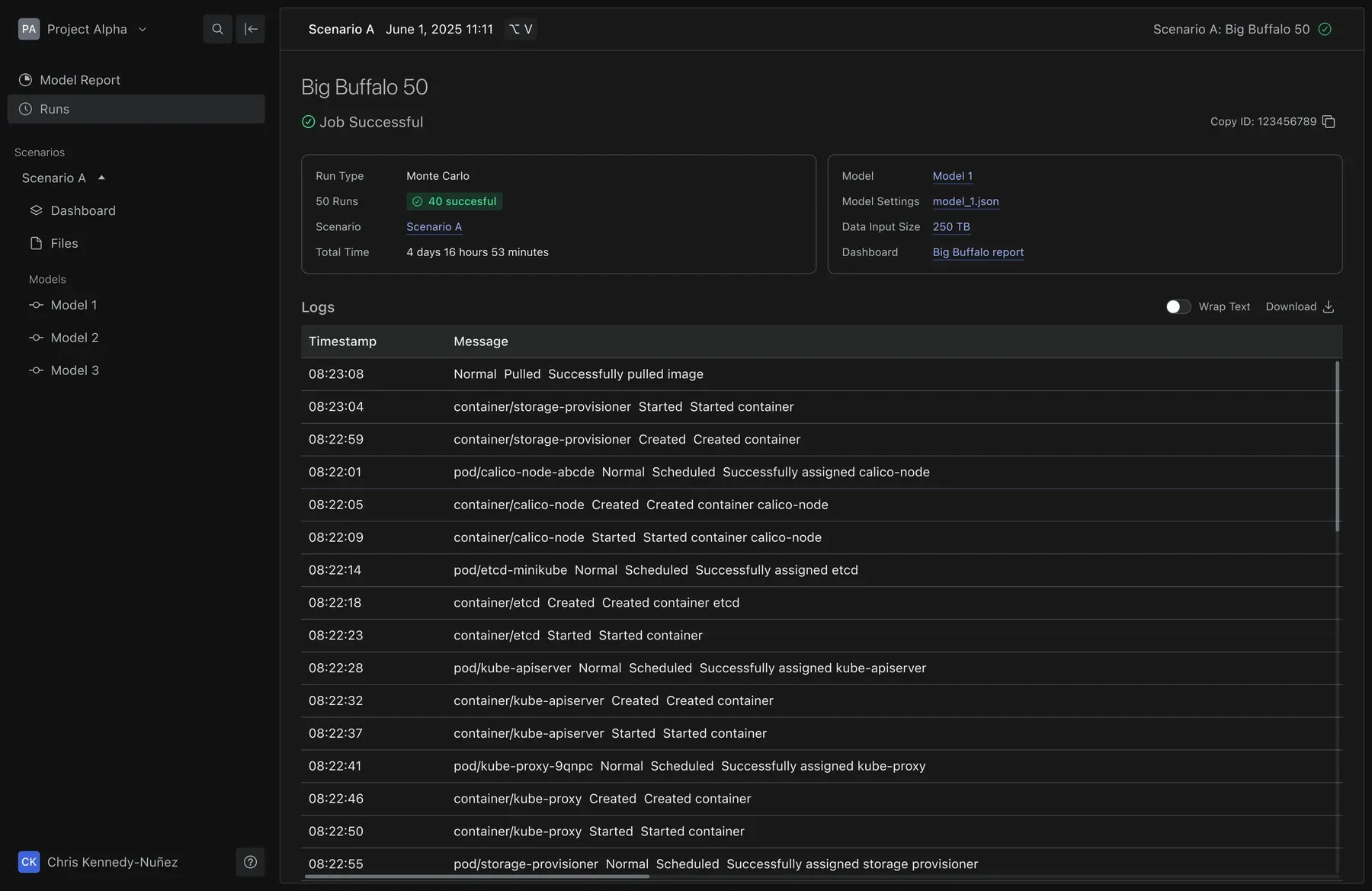
ML engineers and data scientists are our secondary personas, and their surfaces are essential to the MVE. These are surfaces that explain whether a model is working correctly or not. As an example, this mock up shows logs and metadata for processing the data from a model that will be used to create a forecast report. Our secondary personas can take this information and use it to fix faulty models in their preferred tools (like Weights and Biases and Jupyter Notebooks).
03 Pushing on the value proposition.
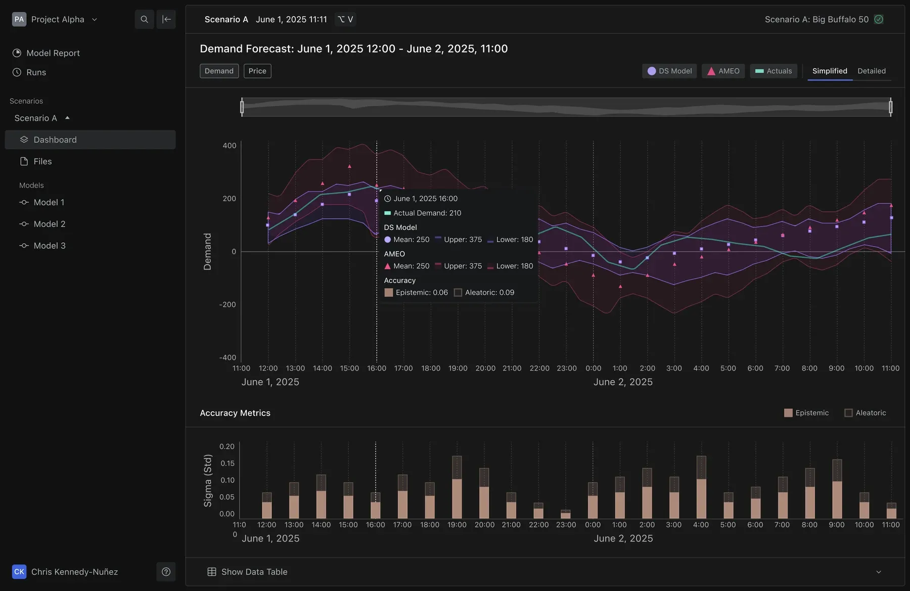
My client offers a more accurate prediction of energy demand and pricing over the government issued projections. Visual clarity became a design pillar because users would be comparing the two. This chart and the data visualization work that followed (see next section) were the most important hours spent from the 90-hour pool of my contract.
Redesign the reading experience for two competing forecasts, rather than display them side by side.
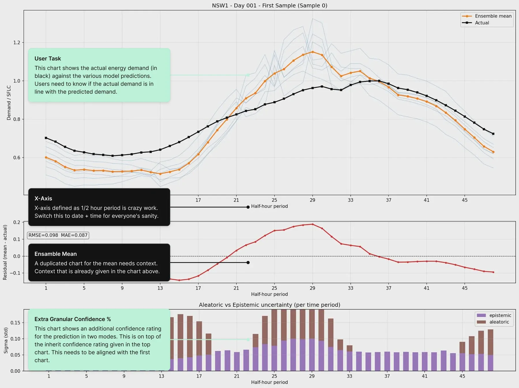
The government forecast wasn’t a simple line — it was 30–40 individual model runs, three summary lines, and a half-hour period x-axis that required mental math to read. Adding QuantaLyric’s forecast on top didn’t just create a visual problem; it created a literacy problem: users would need to understand both charts before they could trust the comparison.
- Preserve the government chart’s conventions, add QuantaLyric’s forecast alongside it
- Redesign the reading experience for both, optimizing for the comparison itself
- Outcome
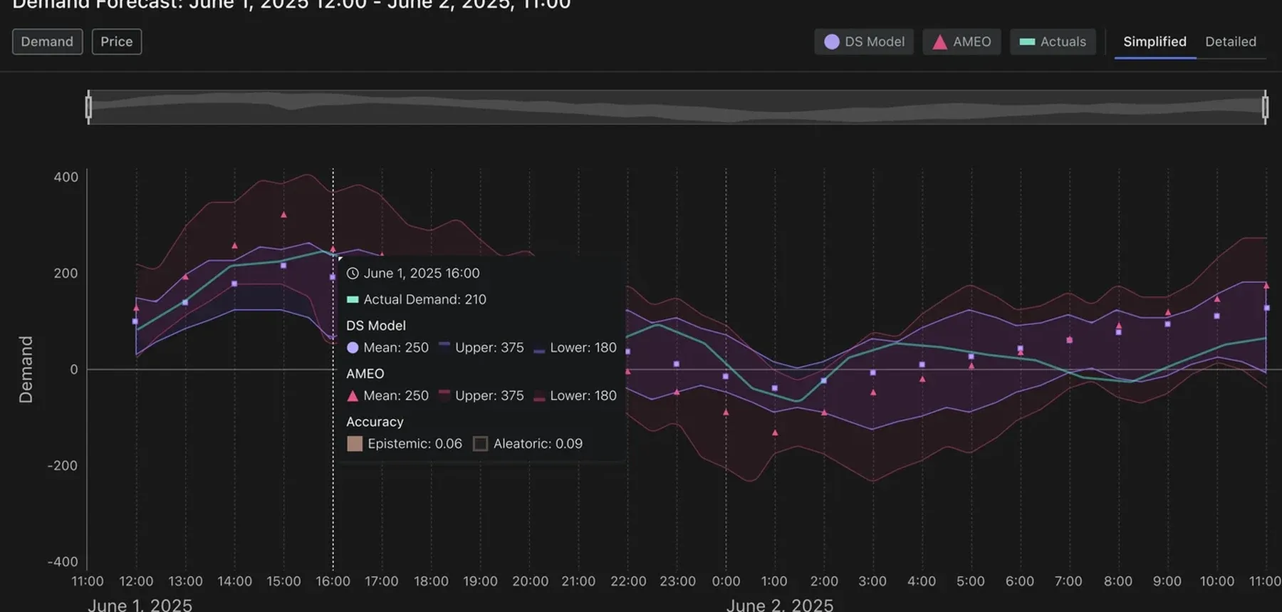
- A single unified chart where both forecasts coexist legibly — the overlap between them readable at a glance, the detail available on demand.
Internal Signals
- —The x-axis alone was a blocker: “half-hour periods” starting at 1 and incrementing by 4 meant a trader reading the government chart had to mentally convert tick marks to timestamps before they could act on anything. Matching that convention would have imported the confusion directly into QuantaLyric’s product.
- —Visual literacy compounds: two independently complex charts placed side by side don’t halve the cognitive load — they multiply it. A trader comparing forecast accuracy under time pressure needs one surface to read, not two.
- —The 30–40 individual model runs in the government chart existed to communicate margin of error and risk, but required interpretation. The design problem was finding a way to surface that same information — range, confidence, risk — without requiring the user to hold 40 lines in their head simultaneously.
External Signals
- —The founder, formerly the Director of Energy Infrastructure for the Australian government, described his own reading experience with the government chart as the reference point: what he wanted most was clarity while reading, with the option to add detail when tracking a specific model’s forecast. That framing — clarity first, detail on demand — became the organizing principle for the chart’s interaction model.
- —Higher forecast accuracy directly translates to cost savings on generator dispatch and prevention of undersupply. That meant the accuracy comparison wasn’t decorative — it was the core decision support surface. If a trader couldn’t immediately see whether QuantaLyric’s forecast was better than the government’s, the entire value proposition failed at the moment it mattered most.
The before.
This chart shows a simplified forecast a trader would receive from the government. The challenge here is to get both forecasts to exist in harmony.
The after.
Managing cognitive load is the way we get both forecasts to co-exist in the same space. Formatting, composition, and micro-interactions do the heavy lifting here.
For example:
- Both forecasts are shown with range line charts with transparent areas to show where QuantaLyric’s and the government forecast overlap.
- The x-axis is labeled with date and time, and hover interactions highlight a vertical slice through the chart. No mental math needed, just the facts.
Joseph Nunez
I had engaged Nahi for several projects. These projects involved UI/UX design for energy market mathematical models and stochastic modelling processes using state-of-the-art ML/AI methodologies. Nahi was able to break down the core experience, expectations and requirements that helped reduce the mental load of an already complex process. Of note is the design of an analytics dashboard that catered for several forms of color blindness and other key accessibility features. I highly recommend Nahi particularly around UI/UX work involving data and modelling.
QuantaLyric Founder
04 The tactical, and practical.
Returning to the constraints of the project, with the limited resource we had as a team. I had to make choices about where I would invest my efforts.
Radix UI as the foundation, not a custom design system.
A bespoke system would have looked more distinctive on day one. I chose Radix as the foundation and kept custom work for the moments that actually carry the product.
- Distinctive from the first commit
- Months of dev capacity back
- Outcome
- Radix carried the workhorse surfaces. As the team grew, custom data-viz components layered on top — including the accessible chart palette and the forecast confidence band — without ever rewriting Radix primitives.
Internal Signals
- —Solo designer, one part-time engineer — every custom primitive was a week we wouldn’t get back.
- —Identity lives in charts and the forecast confidence story, not in buttons and inputs. Generic primitives are fine there
- —Accessibility primitives in Radix would survive scrutiny later.
External Signals
- —Limited financial resources meant custom UI components would take 6-8 weeks to build, which would be a oversized allocation of money to a problem that has already been solved.
- —Hiring is slow in Australian energy — when the team eventually grew, Radix would scale with it without requiring a component rewrite.
- —Trader preference showed “calm, familiar” interfaces won trust; flashy custom UI read as untrustworthy in a high-stakes purchase context.
Lower overhead means we can do mobile as part of the pitch.
Because I pushed for using Radix to lower overhead, it meant that we could hit a stretch goal of providing a mobile experience. Mobile would be the first touch point in a pitch, so a proof of concept that worked on mobile covers an important use case for the product.
Color-blindness accessibility from day one.
Accessibility is usually a “fast follow.” I argued it had to be a constraint from the first chart, not the last QA pass — even though it meant a tighter palette and more iteration up front. An arbitrary color palette would have been fast and easy, but would harm credibility with known potential investors who were color blind.
- Wider creative palette
- Government & regulated deals stay open
- Outcome
- Strong accessibility foundation
Internal Signals
- —Prior IBM and HPE work showed how expensive late-stage accessibility rework is — color systems rebuilt, charts re-tested.
- —Brand direction (Dark mode) already pulled toward a tight palette — accessibility aligned with the aesthetic, not against it.
- —Single-owner advantage owning product and brand let palette decisions propagate without negotiation.
External Signals
- —Regulated industry Australian energy government buyers were on the realistic customer list, and gov procurement requires WCAG conformance.
- —Audience prevalence roughly 1 in 12 men have some form of color vision deficiency; energy trading floors skew male.
- —Competitor failure mode competing dashboards relied on red/green deltas. Designing past that was differentiation, not just compliance.
A starter categorical palette.
ML engineers and data scientists are our secondary personas, and their surfaces are essential to the MVE. These are surfaces that explain whether a model is working correctly or not. As an example, this mock up shows logs and metadata for processing the data from a model that will be used to create a forecast report. Our secondary personas can take this information and use it to fix faulty models in their preferred tools (like Weights and Biases and Jupyter Notebooks).
05 Lessons learned for the next time.
Putting together that limited color palette took far more time than I was comfortable with. The commitment to using Radix’s color primitives was likely a sunk cost fallacy on my part. If I were to do it again, I’d use a WCAG 3 color calculator to define the lowest and highest contrast up front, and build a custom palette specifically for data visualization rather than extending Radix’s primitives. The same instinct that cut the MVP to one audience should have cut the color system to one source of truth from the start.